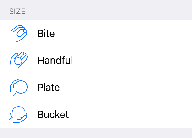
There are four meal sizes in Not So Fast: bite, handful, plate and bucket. From the very beginning I wanted to have icons matching the text to help the users choose the right one. I was thinking about abstract forms and different representations, but nothing came to mind that I found sufficiently attractive and simple, so the beta version of the app was released without icons.
As you can guess, I did come up with something :)
tl;dr: here’s the final version live in the app at this moment:
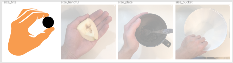
Drawing is not my forte, to say it mildly. I guess I have the eye but not much skill: I can see that what I draw is bad yet I either don’t know or am unable to fix it. One day it hit me: why not draw a direct representation of what the user sees? A bite is something small held between the fingers. A handful is just that, something in the palm of your hand. Same for plate and bucket. I thought using a hand for scale would make the icons self-explanatory. So I sat down, picked a few items lying nearby and made some shots.

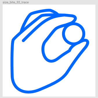
I liked the idea, but how to translate it onto the screen? My first approach was to trace the photos directly and see where it took me. I quite liked how the first icon turned out, it worked really well on my big display.
You can see that I didn’t bother tracing all but the first photo, the reason being it didn’t work in small size at all. I underestimated the level of detail. On iOS, table view cell icons are just 32 by 32 points in size. There is no way such a detailed icon would work.
Do you know how iOS toolbar icons look? They are very simple, with widely spaced lines stroked 1 point wide. I thought it was just a minimalist design choice and more complex icons would work too, but after trying myself I know now that it’s necessary to simplify icons as much as possible or they won’t work in small sizes.
I tried a simpler, but still lifelike approach by tracing the photo again in a much smaller size, or if you prefer, in a much thicker line with way less detail than before. Again, on the big screen it worked well, but the lines would be squished together into an illegible mess on a device.
I was ready to give up on this icon idea, because at this point I had to draw something from scratch, not trace a photo. Even in such a small size, 32x32, it proved quite difficult.
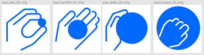
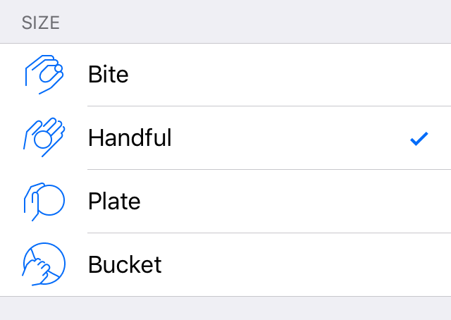
Eventually I used a bit of tracing, using photos as reference, but not as a direct guide. This version turned out pretty well! I decided to use a filled shape for food and an “empty” shape for the palm. The hand didn’t fit on the edge of the bucket so I put it inside, which created the feeling of a cavity and unnecessary connotations, and some users told me about it. At this point, though, I was creatively spent and needed a break to reflect and decide what to do next with the icons. I also had several features not yet implemented and I wanted to finish them first before making a second pass on the icons. These would do for now.
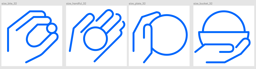
I found it funny how the first, “bite” icon turned out to only have two fingers, despite three being visible in the photo. I tried drawing the ring finger multiple times, but it just wouldn’t fit or would be jumbled in small size. My wife suggested just cutting it from the icon, I did, and lo and behold, it was actually unnecessary. Up close, the hand with just three fingers looks weird and a bit alien, but in small size it works quite well. Thick lines, when positioned near other thick lines, alter their perceived dimensions, so what looks boxy and unproportional when magnified, looks great when it’s very small. It’s a really interesting optical effect, and probably has a name.
In the app the icons looked pretty decent in small size despite my concerns, but the filled shape felt very heavy and pulled too much attention.
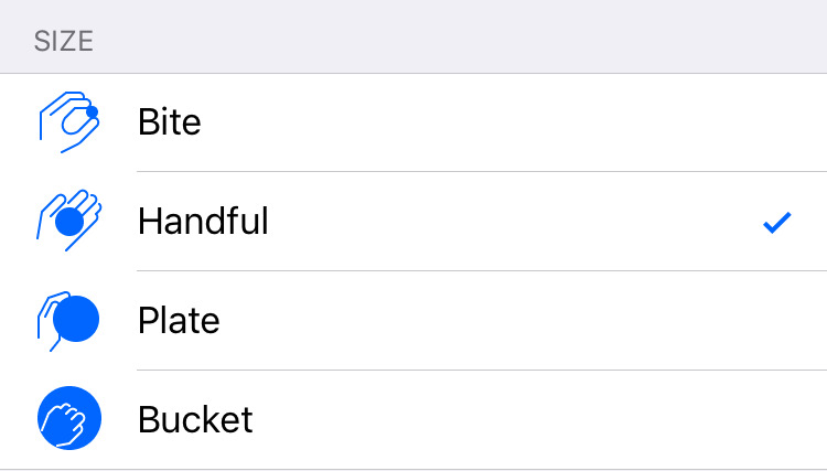
After a few days I made another pass on the icons, using suggestions from the users. I made the meal shape empty and it immediately improved the overall look and feel. Now the icons looked a lot more like stock iOS icons, which was a good result.
The plate icon got a bonus in the form of a finger which covered the edge. I couldn’t do that with the filled shape, because I would have had to use a white outline inside the shape and a blue outline outside, and their joining would not look good at all. With the shape empty, I didn’t have this problem any more and the hovering finger made the icon more believable.
I kept struggling with the bucket icon. At least with the empty shape, I could cross the bucket edge and added a sort of a handle. I really wanted to keep the top-down look, but clearly this idea wasn’t working out. I even understood why: people often have to deal with bites, handfuls and plates, but when it comes to larger sizes, there is nothing common and instantly recognizable. I couldn’t draw a bigger plate because it wouldn’t fit, I didn’t want to make the hand smaller to account for scale, I hated the literal “bucket” metaphor because you don’t really deal with buckets of food, and if you do, they are somewhere in the middle of a table and you still use a plate.
I shared my woes with my social circle and got back a few promising ideas. I thought of them before, but now it was obvious that the top-down look wouldn’t work.
I reluctantly agreed to use a side view, and with that at least I had some choice. I could now draw a convincing “bucket” but this hadn’t been my intention in the first place. I got an idea to reuse the “plate” hand: notice how on the new bucket icon the hand is mostly directly mirrored with some minor adjustments.
I also wanted to keep the circle metaphor for a meal, and what better sideways view, than a slightly bigger plate, but with too much food piled on it?
Still, I don’t like the new bucket icon _completely_, but it’s the best I can do for now that keeps the style coherent across all the four icons.
If you have ideas about what could be made better, you’re welcome to share them!

